
Yesterday I was watching a video by Film Riot in which they were showing off how they created a short by using a motion capture suit and Blender. The short itself was pretty funny, but the technical aspects were really only relevant for someone who might be considering motion capture.
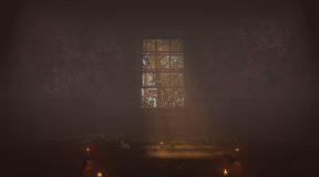
But at the end of this video — I hope it’s this video — they were talking about this video’s sponsor (which is not important) and one of the stills they used during that “infotisement” was this one:

I saw that and thought “I can make that!”, so I set out to do so.
Preparation
Unlike the last project, I didn’t compile any reference images beyond what you see above. I mean…it’s a hallway. There’s a floor, some walls, a door, and some lights. There’s also two side-doors, and some wainscoting with wallpaper and some carved relief details along the railing. There are also several carved pillars at each corner.
The Model

The model really is as simple as it sounds. I Everything in the model is custom with the exception of the lights and the doorknob, both of which were pulled from BlenderKit.

Texturing
There’s not a whole lot going on. The floor is a wooden image texture set from BlenderKit. Everything else is custom made with the exception of the wallpaper on the lower half of the walls, and the textures for the lights and doorknob which came with those models.

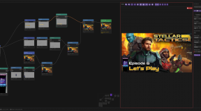
I had recently learned how to do layered texturing and texture painting through a very informative video series from CG Boost. Above, the “Walls” are just two RGB nodes mixed with a grunge texture that controls the reveal of a darker color through a slightly less-darker-color. The problem here was that I couldn’t vary the colors too much lest I lose control over the colors I wanted. Because the hallway is so dark, I needed the base and grunge colors to be kinda close to one another, but that lead to a lot of fiddlin’ with the sliders.
The “Wallpaper” was downloaded from Fab (i.e. Megascans). I applied the images using Node Wrangler, set up a new image within Blender, and use that custom image as a canvas for texture painting.

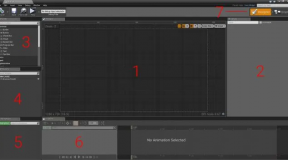
I had to do a lot of UV island refactoring to get it to work. The white areas contain islands where the wallpaper shows through while the black areas are where the normal blue grunge wall colors show through. This worked well enough once I figures out what I was doing; I had forgotten the video lessons and was going to re-watch them, but I managed to find my footing before committing myself to 45 minutes of sidebar activities.
Lighting
As always, lighting is my absolute Achilles Heel.

I have four area lights here. The first is right outside the door. The door windows use Glass BSDF texturing for transparency and while I didn’t frost the glass or anything, the light panel outside is just white, so frosted or not, it looks how I wanted it. It’s also angled a bit because I noticed that the right side of the hallway in the original seems to be getting more direct light than the left side.
A small area light inside the hallway is looking down on the door, and this was to enable shadows that weren’t there otherwise. I made sure to slap an Ambient Occlusion node on the material used for the inside of the door, and also needed the light to add reflections on the light fixture near the door as well as the doorknob assembly.
A medium sized area light is inside “one of the side rooms” as it seems to be in the original image. Finally, a larger area light is facing down the hallway towards the camera, and is providing some of the light needed to get the reflections along the wainscoting molding, because the light from the front door wasn’t reaching that far.
What Works
Overall, I think it all works in it’s own way. Near the end I was obsessing over getting my version to look exactly like the original, but I didn’t know about some of the settings like camera focal range and angle, and of course I didn’t have original matching textures. As a stand-alone render, I’m exceptionally pleased even with the lighting scheme. I also like that I was able to get DoF understood well enough to be worth using.
What Doesn’t Work
First, the floor image textures don’t have enough AO on the horizontal edges to make them visible. As a result, the boards look like very long, very continuous boards running the length of the hallway. I might have been able to throw the maps into Affinity Photo and sharpened up the edges, but I did not.
I also didn’t add in the carved wood that runs along the wainscoting molding. Funny thing is, I have been reading up on trim sheets and thought that this would be an excellent time to use them, but I couldn’t find any good trim sheets out there, and didn’t want to spend the time making my own for this, so the wide molding is just left blank.


4 Comments
stargrace
March 4, 2025 - 1:45 pmAs someone who knows NOTHING about any of this, but finds it fascinating (and may know a thing or two about what feels right artistically/visually) – I wanted to comment and say I like yours MUCH BETTER than the original that you’re trying to emulate. Specifically, your lighting (which I know you mention is your Achilles heel) comes off better (IMO) and your textures. The light they have on the right hand wall at the end throws me off of their still, and their lighting just doesn’t feel right to me, visually. Don’t be so hard on yourself!
Scopique
March 4, 2025 - 3:07 pmThank you!
Tipa
March 4, 2025 - 3:32 pmI think yours looks really close! What a fun project. I think if you added a small amount of haze in the corridor, it would help get that diffuse glow from the light outside the door.
Scopique
March 4, 2025 - 8:30 pmThat’s a good point. I would say “I’ll go back and add it in!” but I’ve said that about all of these projects and…
Comments are closed.