Scopique
 Scopique
Since my initial post, I’ve been making an honest effort to use Amsel to set up my Secret World resource database.
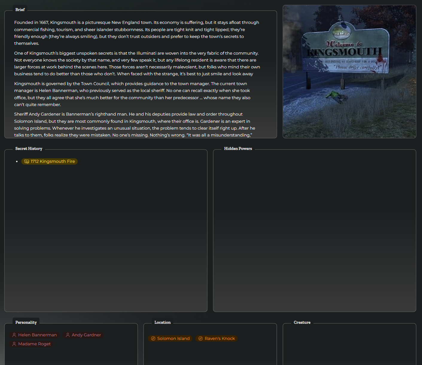
I’ve used the Secret World Core Rulebook from Anvil Studios as well as online resources built from both TSW and SWL to start a “lore bible” that I can customize. Right now, I have five templates — Creature, Events, Location, Personality, and Organization — and stubs for 15 pages built from those templates.
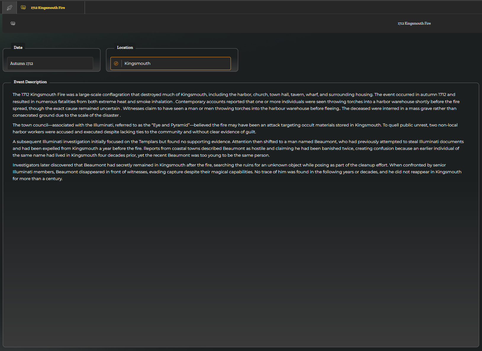
As with anything like this, once I start working with the tool, I solidify my opinions on it’s fit for my task, and in the case of Amsel, I am finding it lacking.
Templates: Functional, But Only Just
My first complaint is that templates are 100% dedicated to functionality, and have no options for appearance. This might seem like a small matter as the whole point of the template is to drive a page, and a page is really just a data entry screen. This is also undervaluing the price people put on making things look aesthetically pleasing to their eye.
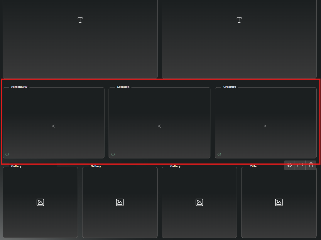
Consider the Location template. The highlighted boxes are called “mirror runes” within LORE. These boxes allow me to select references from other categories or pages built from a specific template. I have three of them here: Personality, Location, and Creature. The box titles reflect the templates they source from. However, those labels are non-intuitive. A location can include links to “Personalities” and “Creatures”, but what does a Location need to know about a “Location”? What does it represent in relation to the page I will build from this template? While I suppose that it could be inferred that the “Location” mirror refers to “locations contained within this location”, such as Raven’s Knock located within Kingsmouth, which is contained with Solomon Island, I would have preferred to either edit the label of these mirrors (which I cannot do), or to hide the default label and add a new, stand-alone label above the frame. The fact that there is no label control that I can place within a template seems like a gross oversight. Coming from a web development background, I feel that separating a label from what it labels is UI design 101.
The Size Issue
In my last post I mentioned that I had a big problem that I had found a solution for. Well, turns out that my solution wasn’t really a solution; it was just a different kind of suck.
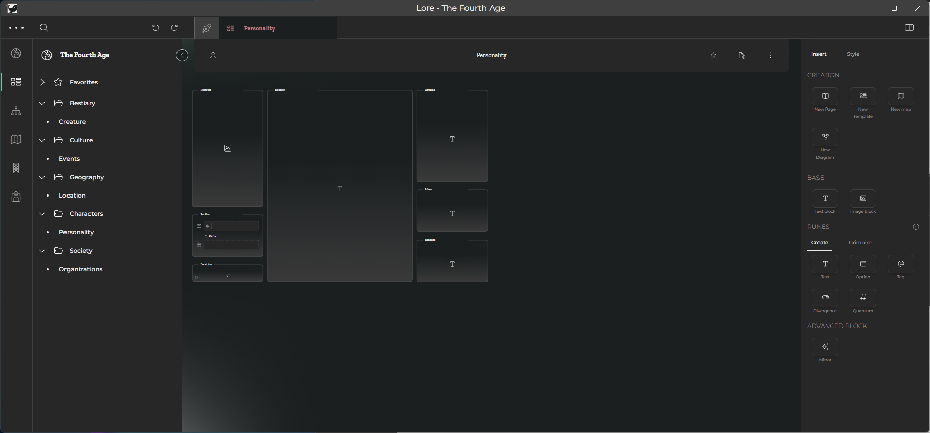
Here’s how I designed the Personality template.
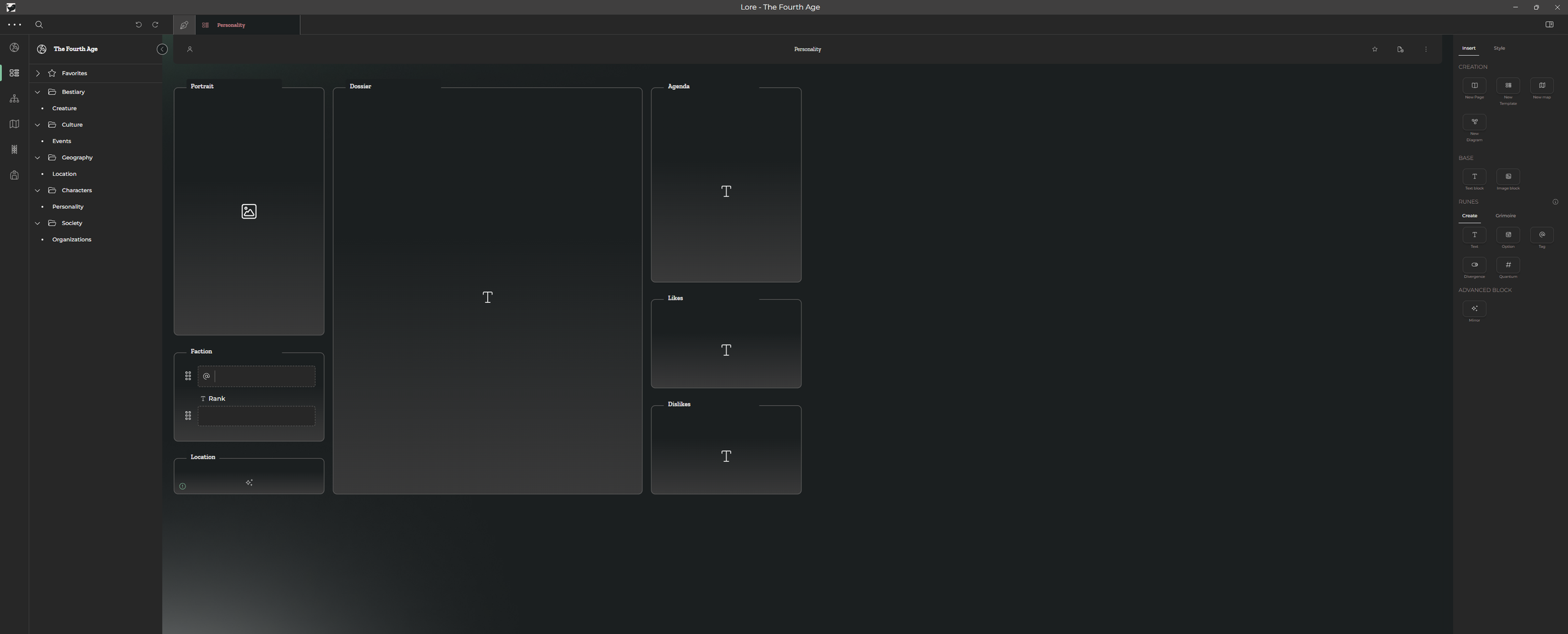
I am using a 16:9 aspect ratio monitor, and this image represents LORE maximized on that screen. My natural inclination is to use the available, visible real-estate when composing my form so I can have as much info on the screen at once. Knowing what I know, I stopped myself from working horizontally and instead worked vertically as we are all used to scrolling vertically with our web pages and documents.
However, this is what happens when I un-maximize the LORE window
See the difference? Maybe not as well as you could, so here’s what this looks like with data.
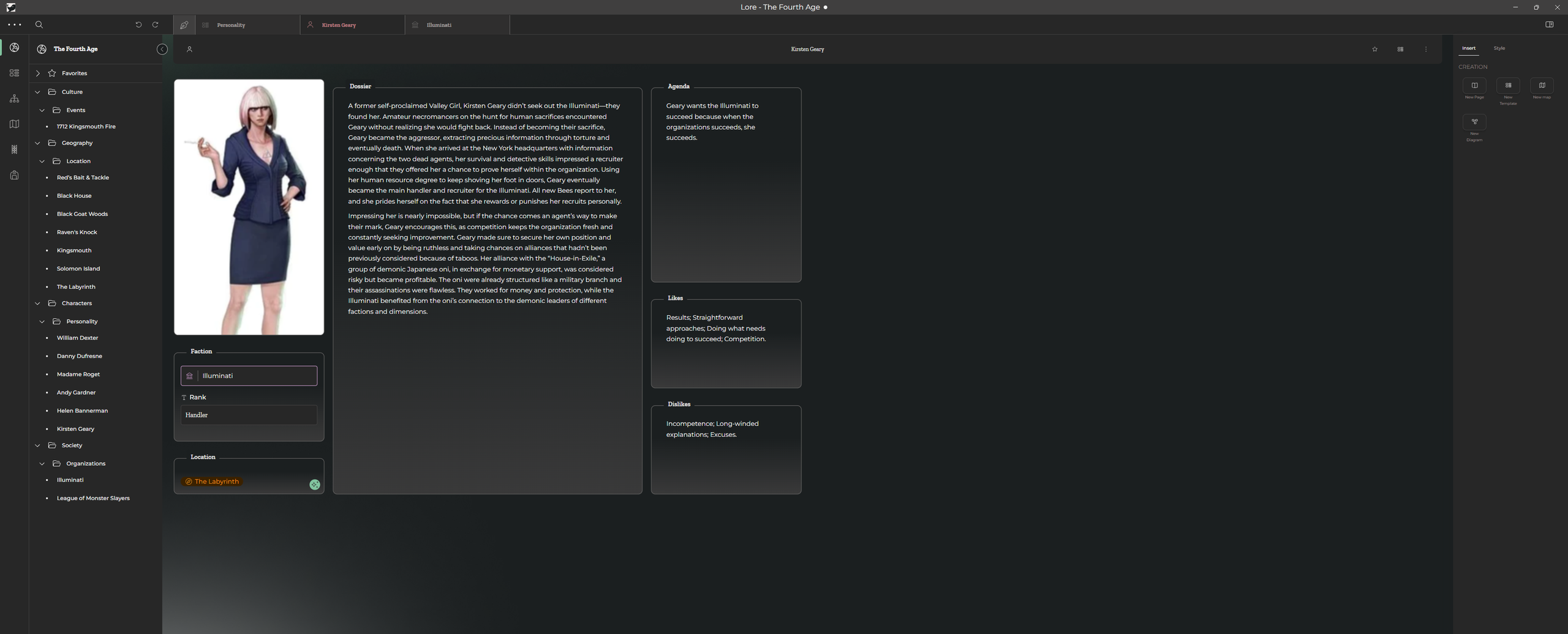
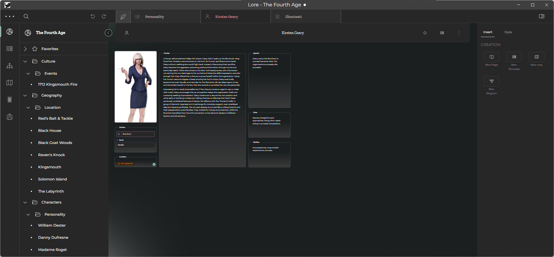
I guess it’s harder to see here, but in windowed mode, all of the form elements and their contents scale down, effectively keeping the same height to width ratio as in the full-screen version, but the contents were scaled as well. This makes things difficult to read, especially for large blocks of text.
If I disable the setting that I found the other day, however, things get significantly worse.
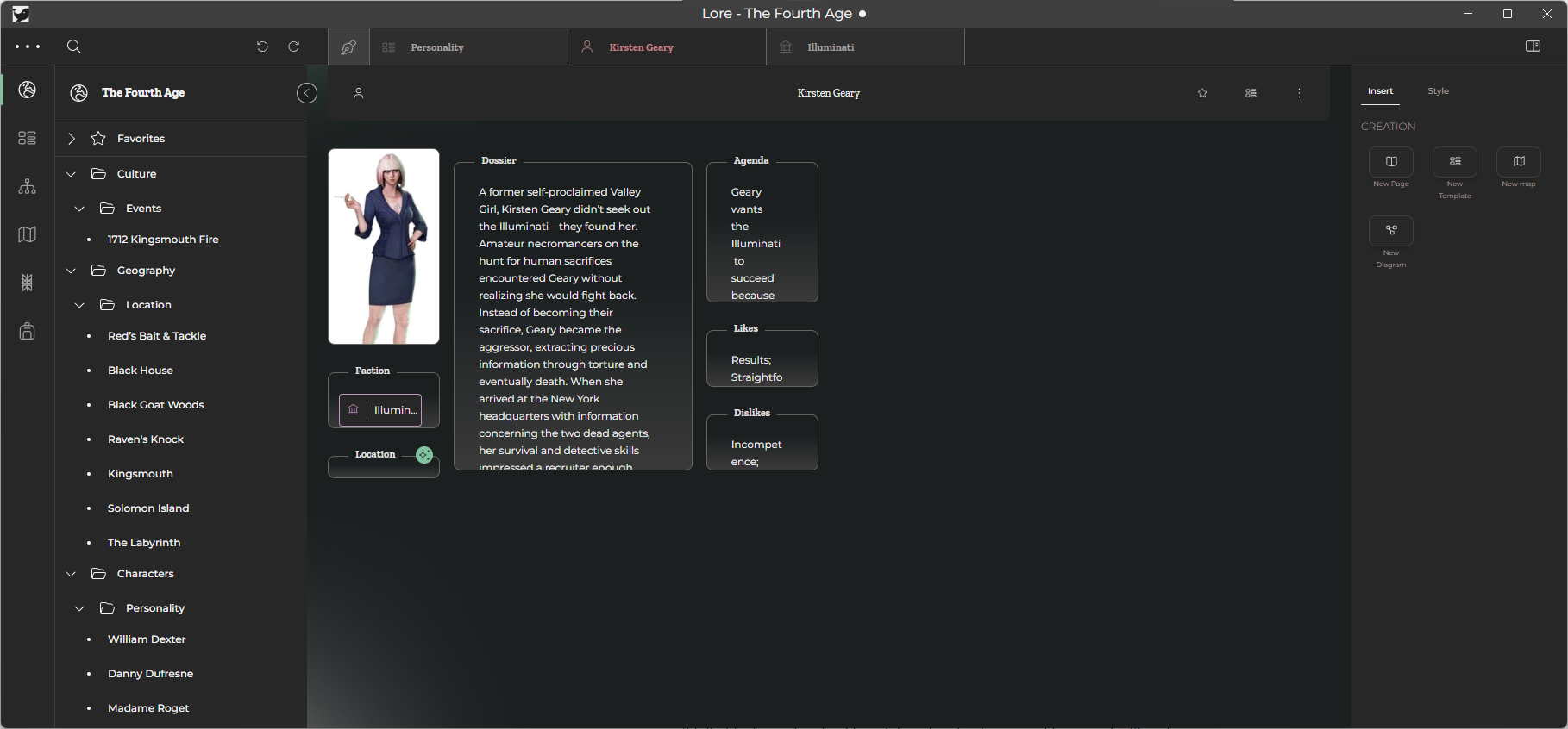
Now, the height to width ratio changes, but the contents remain the same.
All in all, this makes the app pretty much unusable unless it is always used on the same monitor size, at the same resolution, in the same window mode every single time. Considering the LORE file and templates are portable for sharing, I can’t understand why this is something the developers have let slide — I’ve seen posts on the Discord talking about this back as far as 2024.
Lack of Formatting
Kind of alongside the lack of customization options for templates is the lack of general formatting options.
All widgets on a template come with their own border. Text blocks fill those frames without an internal border to demarcate the entry space, but text “runes” are simply text boxes. All runes come with a label pre-attached (which doesn’t solve my earlier complaint), but can be “removed” by simply blanking the value.
What we do not have are options for formatting. Being able to set a font and font-size is important, especially since template controls snap to the canvas grid…a grid which we have no direct control over. Considering that the frame of a widget is what is snapped, this is a common result:
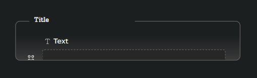
Attempting to make the frame taller snaps to the next intrinsic stop, which results in this:
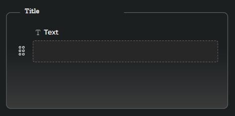
Neither is acceptable. Removing the label in the first example does help, but considering that this is the only solution, I find the lack of foresight on the developer’s part kind of disturbing.
Instead, a template-wide font-size default would be better, with per-control font-size options being available. More importantly, do not frame controls by default. This is what gets me, and I know that because “runes” can be used together to form a compound control that the frame is a logical indicator telling the builder that “everything inside here is part of a compound control”. Ideally, every control would behave like a rune on it’s own, and then a designer could draw a frame to encompass several controls to create a compound control. Frames could otherwise be decorative and not command their contents on the grid like they do now. I look towards Mithos for how I’d prefer Amsel to treat it’s forms: with a definitive height and width, set by the user, for the canvas, which is then allowed to scroll both vertically and horizontally.
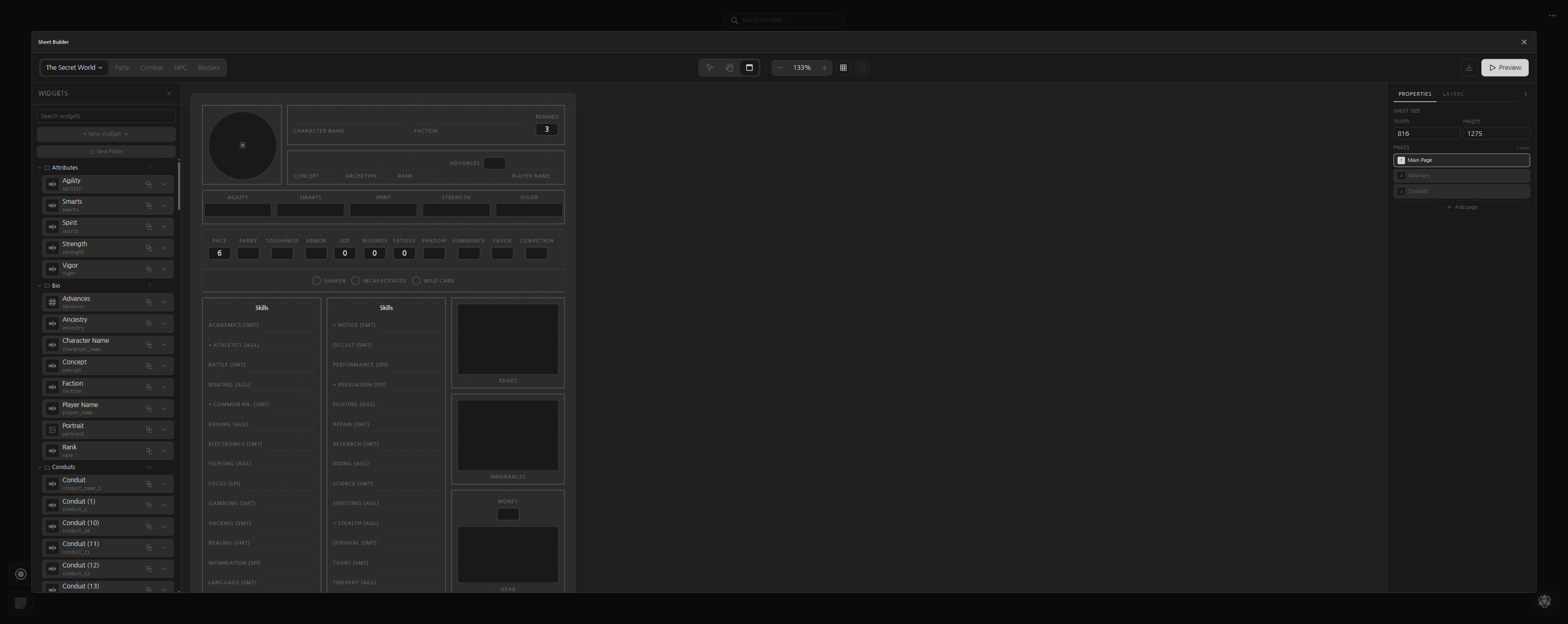
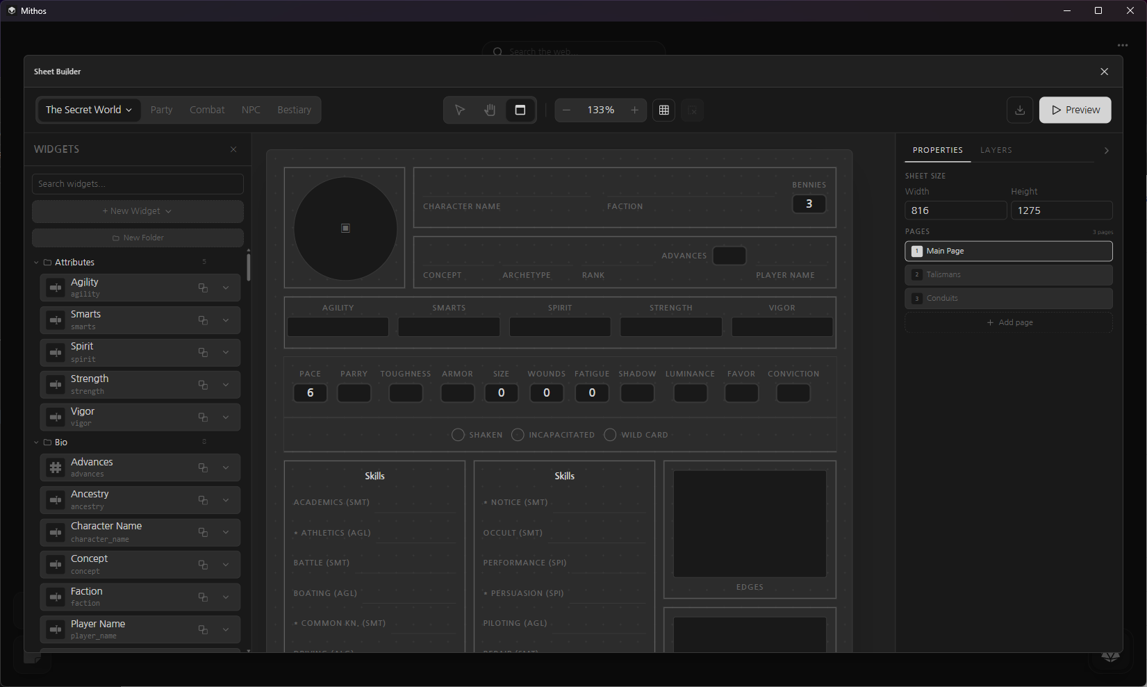
In doing so, users can work both vertically and horizontally to their heart’s content, unbothered by the dimensions of the parent window as the canvas simply “floats” at it’s user-specified height and width.
I truly wish Mithos was a bit more ambitious than it is. Mithos does have the ability to create Markdown files which can be saved anywhere and loaded from anywhere — including my Obsidian notes — but it doesn’t have the same categorization or hyperlinking functionality that LORE does, for example. Mithos has it’s own lane, though, and while I have some issues with it and how it does a few things, I know that my expectations and needs aren’t what Mithos is designed to do, but I think it’s as close to what I’d like an app to have for features as I’m going to get at the moment.