I’m not usually posting breakdowns because I’m particularly proud of what I did or how I accomplished whatever I set out to accomplish, but this case is different.
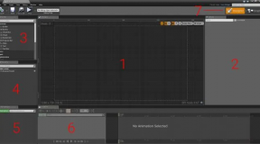
I created a Fusion animation for a recent Let’s Play video. The idea is that each video would recap major plot points that happened in the previous sessions, and I wanted a quick animation that would introduce the recap segment. Since I had created a retro “branding” animation with an arcade cabinet and pixel graphics, I thought I’d continue with the “Nu-Retro” theme and have the word “Recap” fly in over a background of “anime flying lines” or…whatever they are called.
Retro
Animation of the text was pretty straightforward. It starts off the canvas on the left side, and then transforms its position along the X axis until it reaches the center of the canvas. It waits for a few seconds, then transitions off the canvas, stage right. This was just a matter of keyframing the positions, dealing with the transitions, and putting it to bed.
I did add some bounce to the operation though. I animated the Sheer property of the text to have it “lean back” on it’s way in and out of the canvas. When it stops in the center, the Sheer property reverses direction briefly for that “bong!” effect.
Flying Lines
This is where the hard part came in.
There are certain tasks in motion graphics that should be easier than they are simply because they must happen all the time. I see them used a lot in basic motion graphics lesson: animating stroke is one of them; moving elements into and out of the canvas is another; duplicating elements and having them move about is a lesser occurrence, but not so much that it should require a massive amount of work.
Unfortunately that’s what I found when I searched “flying anime lines resolve fusion”. One video suggested a polyline with a thick stroke, animated across the canvas and keyframe-adjusted to loop over and over. I tried this, but it only worked with one polyline instance; add another, and the console started throwing errors. I saw a cool implementation using 3D text which took advantage of fonts with missing characters, and a whole lot of other advanced-tier nodes, but that was too much work to replicate and modify, and in the end I couldn’t get it to do what I wanted it to do. After searching for a few hours and trying several suggestions, I came up with an idea that I thought should work…and it did.
Particles.
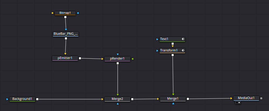
Fusion has a particle system built in which is awesome considering I had to pay for an expensive third party particle solution when I was using After Effects, but I digress. The particle system in Fusion uses two nodes at a minimum: an emitter (pEmitter) and a renderer (pRender).

The first step was to create the emitter. I wanted this to spit particles from top to bottom, so I had to set the Region to “Rectangle” and give it a size that stretched from the top of the canvas to the bottom. It didn’t need to be too thick horizontally though. Since the particles needed to be “whole” as they traveled from one side of the screen to the other, I moved the emitter off the canvas to the right, as I wanted the particles to move from right to left.
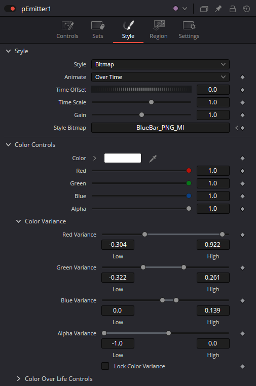
Next, I had to set my particle. By default, particles are just pixels; I needed lines, varied in size, shape, and color if possible. To start, I created a simple blue-bar PNG which fades to transparent as the color progresses to the right. On the Style tab of the emitter’s inspector panel I set the Style to “bitmap” and dragged the PNG node to the Style Bitmap field in the inspector. I also messed around with the Color Controls settings to get variation between blue and purple, which I think fits the motif of the animation and the branding overall.
The Emitter also had it’s Number property reduced to only 4 (from the default 100), the Velocity cranked up to 1.0, Velocity Variance set to 0.3, and the Angle set to 180.
The result is that the particles are now using the BlueBar.png image instead of single pixels, they move quickly, and from right to left. Interestingly enough, I didn’t put any Blur on the particles; they are moving fast enough to look blurred.
The whole “PNG + Emitter + Render” node tree was merged against a Background node of blue, and then the moving text was merged ahead of that. In the end, my particle solution was easier to implement that drawing and copying polylines, or using 3D text, dupe, and render nodes.

